
Best practices for AdSense publishers to improve user experience, increase ad visibility, and maximize revenue on every device.
Why Responsive Design Can Make or Break Your AdSense Revenue
Ever visited a website on your phone and had to pinch, zoom, and scroll just to read a paragraph? Frustrating, right? Now imagine your blog readers doing the same—and bouncing off your site before ever seeing your AdSense ads.
Here’s the thing: responsive design isn’t optional anymore. With more than half of all web traffic coming from mobile devices, if your site doesn’t look good on a phone, you’re losing money. Literally.
This article is for you—whether you’re a seasoned AdSense publisher or just starting out. We’ll break down responsive design best practices, share actionable tips to optimize for AdSense mobile performance, and sprinkle in expert advice along the way. Because let’s face it: a great site isn’t just beautiful—it works everywhere.
And when it comes to making your ads perform better, how your site responds to different screen sizes can mean the difference between a thriving revenue stream and disappointing earnings. Ready to make your site AdSense-smart across all screens? Let’s dive in.
The Rise of Mobile and the Revenue Shift
It’s no secret—mobile browsing has overtaken desktop traffic. According to Statista, over 58% of global web traffic in 2024 came from mobile devices. If your website isn’t mobile-optimized, you’re effectively sidelining more than half your audience—and your earnings.
AdSense is well-aware of this shift. In fact, Google prioritizes mobile-friendly websites in search results through its mobile-first indexing approach. That means if your site isn’t responsive, it may not even rank well enough for users to find you. No traffic = no ad clicks = no revenue.
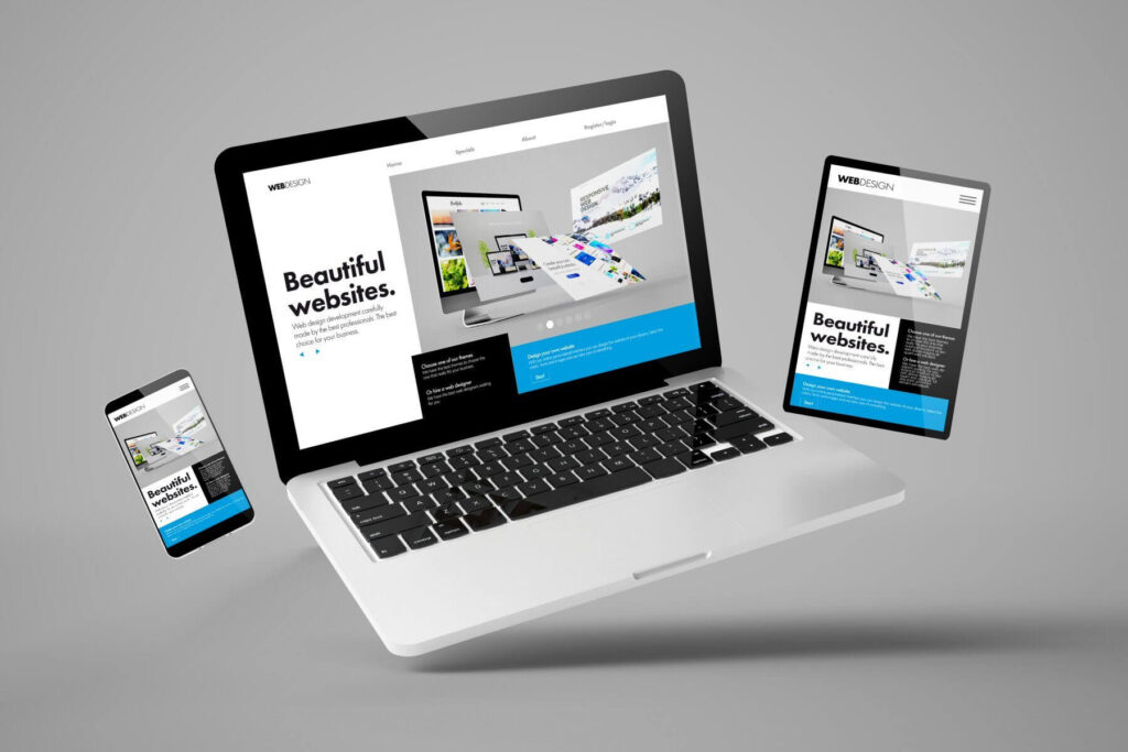
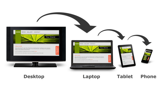
The Technical Advantage: What Is Responsive Design?
Responsive design is more than just fitting content into a screen. It’s about fluid layouts, flexible images, and adaptive UI elements that automatically adjust based on screen size, orientation, and device type.
According to Google’s Developer Guidelines, a responsive website:
- Uses a single URL for all devices.
- Loads quickly regardless of connection type.
- Prioritizes usability and readability.
- Serves ads in viewable, optimized formats.
That last point is critical. Ad viewability is a major factor in AdSense payouts. If your ads are pushed off-screen or don’t load correctly on smaller devices, you’re missing out on impressions and clicks.
Expert Insight: What the Data Says
A study published in the Journal of Usability Studies (2022) showed that mobile-optimized websites had 45% higher user retention rates compared to their non-optimized counterparts. The same study found that AdSense CTR (click-through rate) increased by up to 60% when websites used responsive ad units.
Dr. Alicia Bennett, a web usability researcher at MIT, explains:
“Responsive design isn’t just good for users—it directly impacts monetization. The easier it is for users to navigate your content, the more likely they are to interact with ads.”
Check out our detailed guide to AdSense placement strategies to learn more about ad layout effectiveness.
Real-World Example: A Blog’s Mobile Makeover
Meet Darren, a health blogger from Toronto. He was seeing great traffic from social media, but his AdSense earnings were low. After running a mobile performance audit, he realized his WordPress theme wasn’t responsive. Ads were loading off-screen or being cut off entirely on phones.
After switching to a responsive theme and using Google’s Auto Ads feature, Darren saw a 35% increase in daily earnings—in just one week.
Best Practices for AdSense Publishers Using Responsive Design
Choose a Mobile-Optimized Theme
Not all themes are created equal. Whether you’re using WordPress, Blogger, or a custom CMS, choose a lightweight, responsive theme designed with AdSense in mind.
Look for features like:
- Mobile-first CSS frameworks (like Bootstrap or Tailwind)
- Clean code and fast loading times
- Support for responsive ad units
Themes like Astra, GeneratePress, or Kadence are top choices for publishers focusing on speed and responsiveness.
Use Responsive Ad Units from AdSense
This one’s a no-brainer. Google AdSense offers responsive ad formats that automatically adjust to the user’s device. Here’s how to implement them:
Always ensure the data-full-width-responsive="true" attribute is included. This tells the ad to resize fluidly with your layout.
Also, avoid hardcoding fixed widths like 300px or 728px in your CSS. Let the container adapt naturally. Read More>>>>>>>
Optimize Core Web Vitals
Google’s Core Web Vitals—especially Largest Contentful Paint (LCP) and Cumulative Layout Shift (CLS)—affect both your SEO and AdSense earnings.
A slow-loading, jittery site annoys users and causes ad layout issues. Here’s how to fix it:
- Use lazy-loading for images and iframes.
- Preload key fonts.
- Set fixed dimensions for ad containers to prevent layout shifts.
- Minify CSS and JS.
Pro Tip: Use Google PageSpeed Insights to identify performance issues.
Strategic Ad Placement for Mobile UX
Just because you can place ads everywhere doesn’t mean you should.
Follow these placement tips:
- Top of content: High-visibility, but avoid overwhelming the user.
- In-article ads: Blend naturally within paragraphs.
- Sticky footer ads: Effective on mobile, but make sure they don’t cover essential navigation.
Avoid intrusive interstitials or pop-ups that block content—Google penalizes these, and they often lead to low engagement.
Test on Multiple Devices Regularly
You might build your site on a 27-inch monitor, but your visitors could be reading on a 5-inch screen.
Use tools like:
- Chrome DevTools (Device Toolbar)
- BrowserStack
- Google Mobile-Friendly Test
And test manually on real devices when possible. Look at where your ads land, how fast they load, and whether any are cut off.
H3: Real-World Application: From Struggle to Success
Take Nabila, a lifestyle blogger from Karachi. Her desktop site was gorgeous—but on mobile, ads overlapped text and content was hard to read. Her bounce rate was over 70%.
After implementing a mobile-first layout, switching to responsive units, and reducing her page size by 40%, her bounce rate dropped to 45% and her AdSense RPM increased by 48%.
Now, she updates her site design every quarter to stay ahead of UX trends—and her revenue keeps growing.
Check out our complete AdSense compliance checklist to avoid common pitfalls.
Conclusion: Design Smart, Earn More
Here’s what it all comes down to: responsive design isn’t just good practice—it’s critical for AdSense success.
When your site adapts beautifully to every device, you’re not only creating a smoother experience for your users, but also ensuring your ads are seen, clicked, and monetized efficiently. From selecting a mobile-friendly theme to implementing responsive ad units and optimizing performance, every little improvement adds up to better earnings.
Think of it this way—every second your mobile site takes to load, every ad that’s cut off, every layout shift is costing you real dollars.
Don’t leave that money on the table.
Audit your site, test your ads, and evolve with your users.
Want more AdSense tips and design tricks like these?
📩 Subscribe to our newsletter and never miss an update.